Kindred Bravely
Brand Refresh
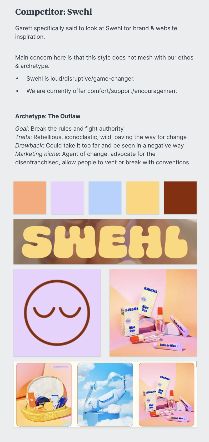
Competitive Analysis
Logo Design
Logomark
Photography Direction
Color Palette
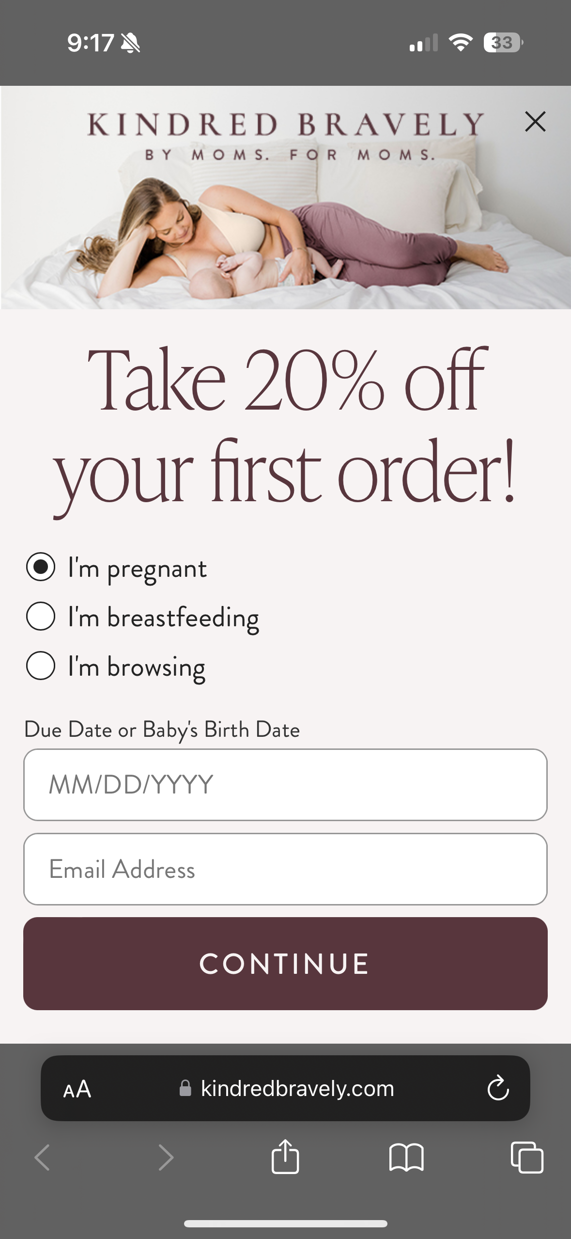
The Kindred Bravely Brand Refresh project aimed to revitalize the company's visual identity to align with its evolving market presence and elevate its appeal to target customers. Founded in 2015 without a cohesive branding strategy, Kindred Bravely had organically drifted from its original brand essence. As a member of the creative team, I collaborated closely with the Senior Creative Manager and Chief Marketing Officer to propose and execute a comprehensive brand refresh. While our target audience and core values remained unchanged, we recognized the necessity to modernize our visual identity to compete effectively and attract desired clientele.


The Process
I developed four distinct visual directions that we could take the brand. I worked closely with the photography team and provided photography direction for each of the concepts.
The goal was to elevate the brand without deviating too far. Simplify. Modernize. Elevate. Freshen. Friendly. Feminine.
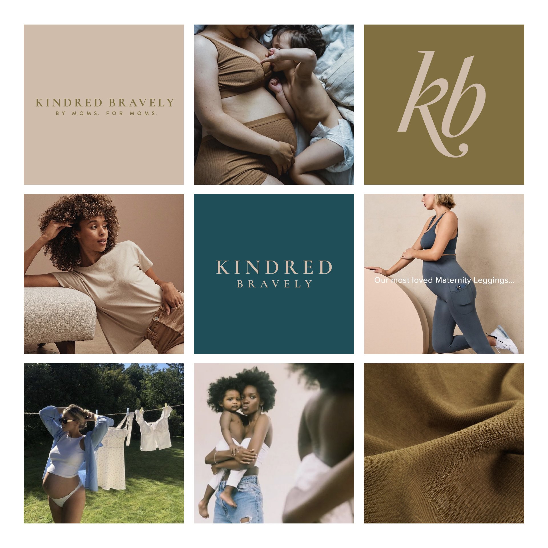
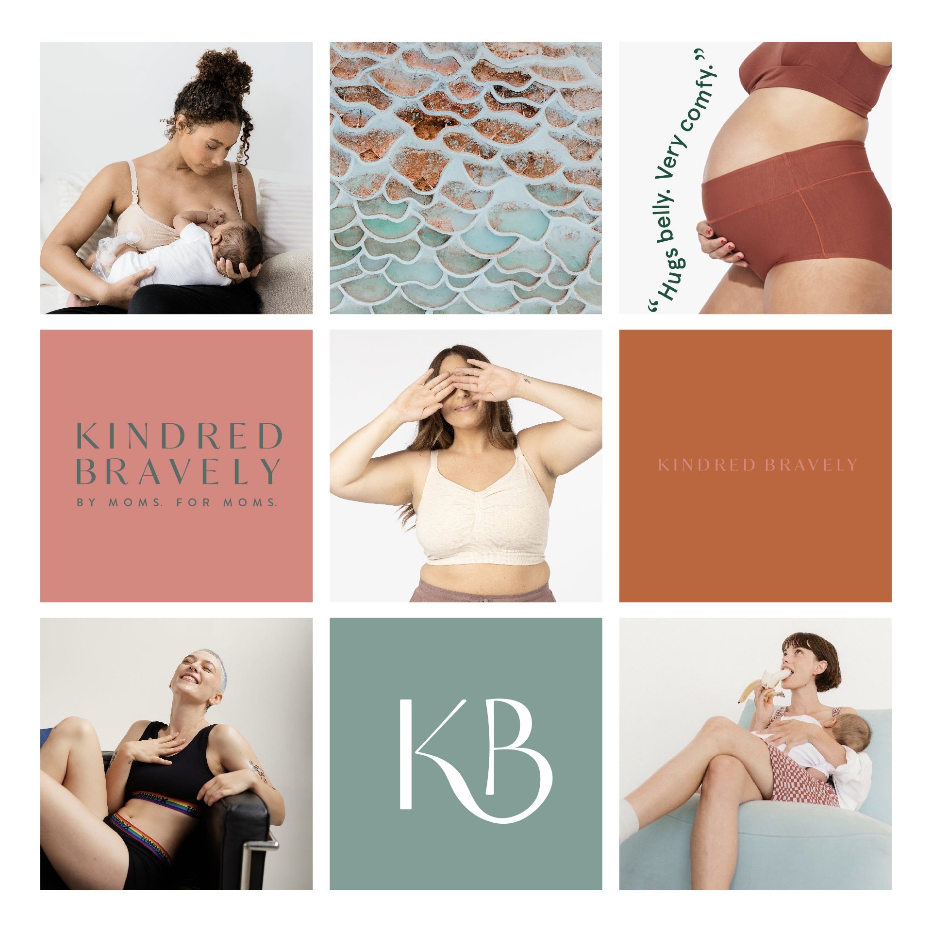
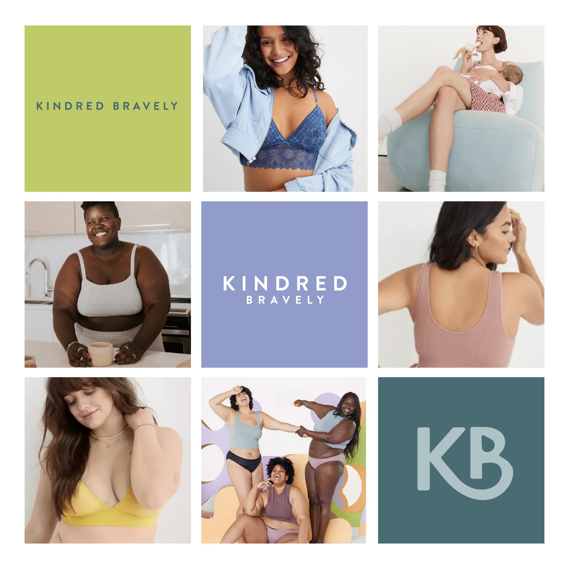

While they loved all the directions, they wanted to play it safer. We landed on a combination of two of the directions. The logo with very subtle changes, almost imperceptible. Then lean into the color palette of our products, what our customer loves and knows us for.